Developing Visuals for Belajar Bekerja
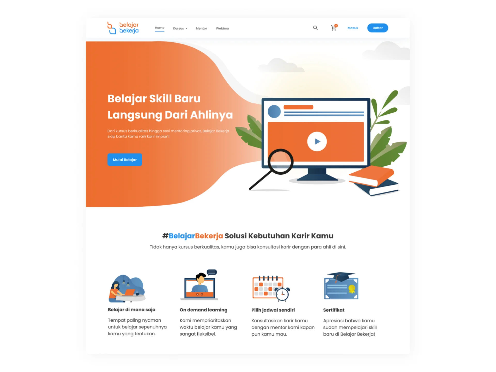
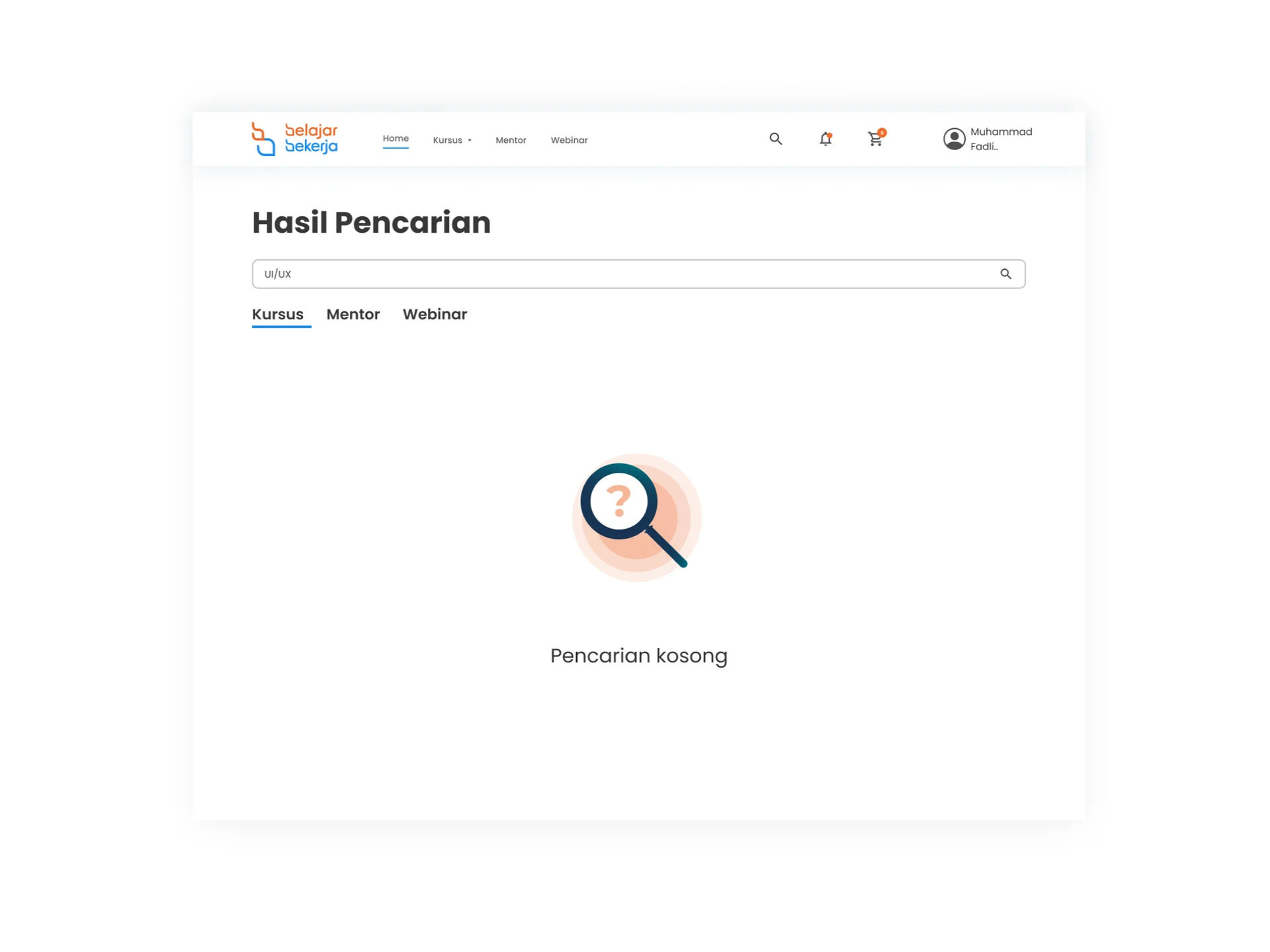
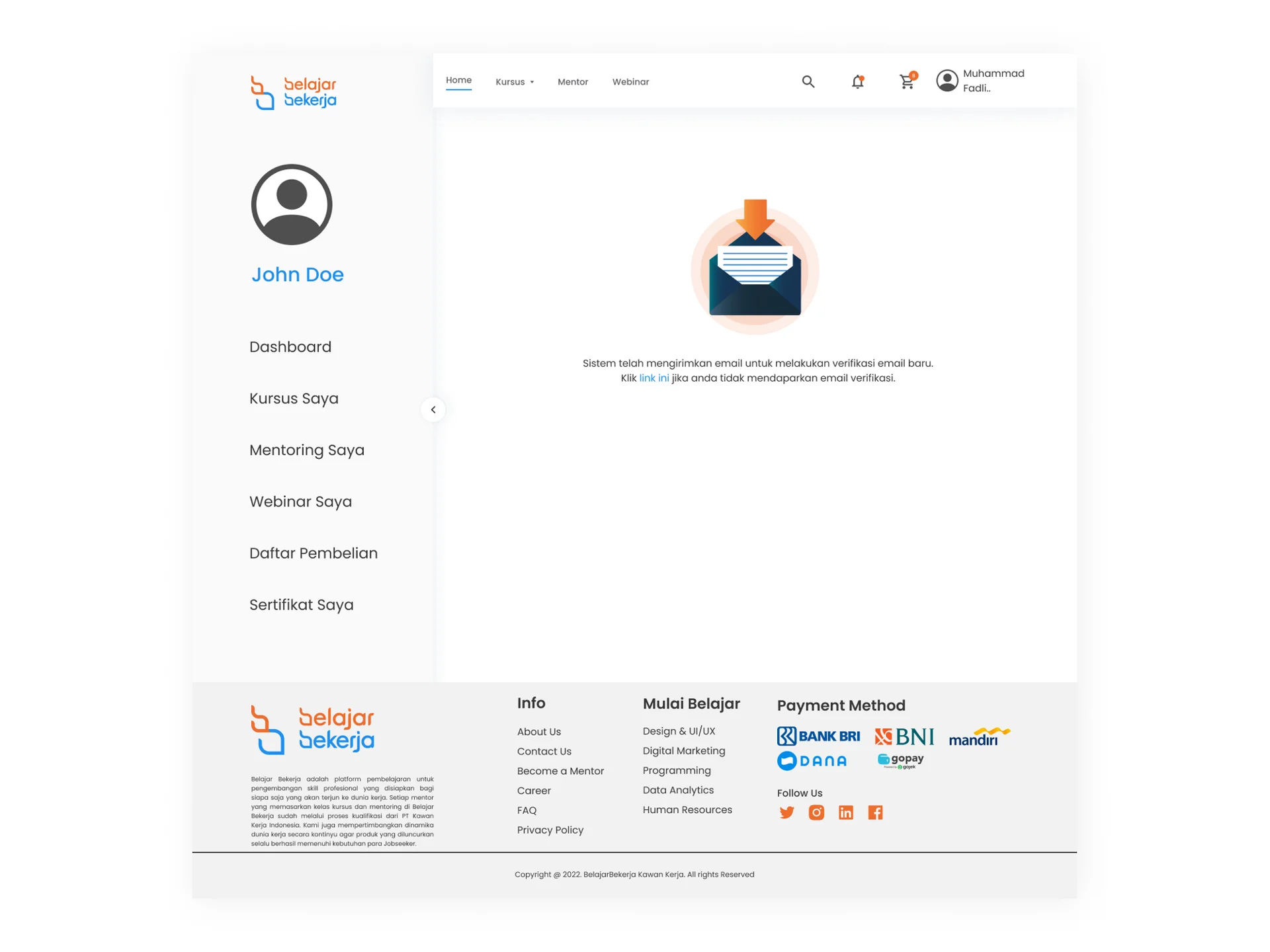
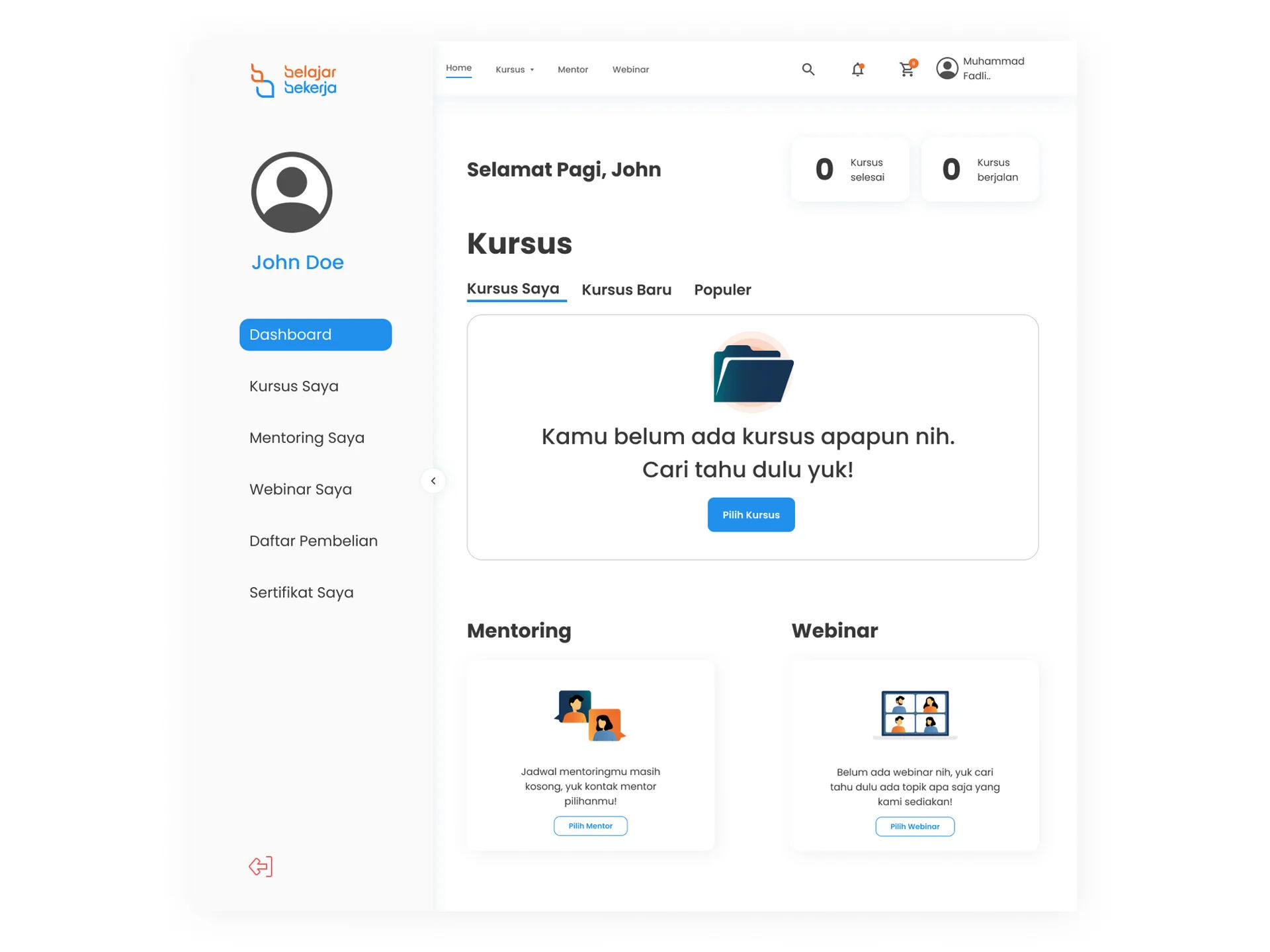
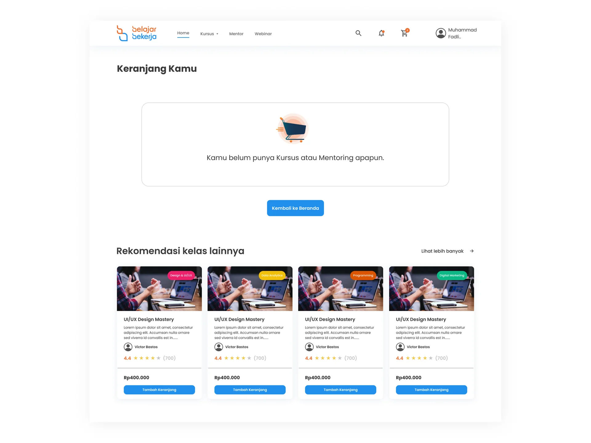
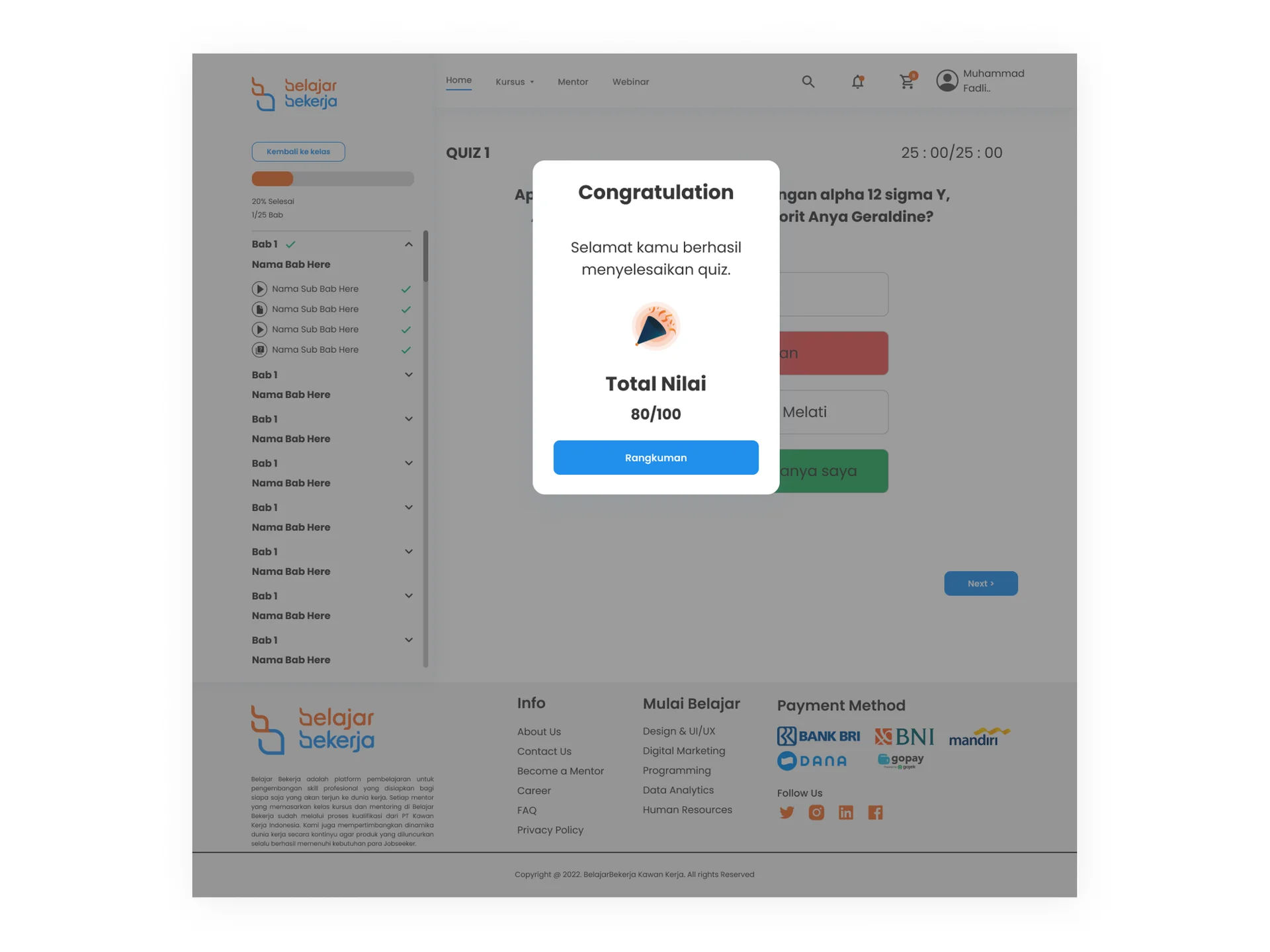
Belajar Bekerja is a platform that empowers job seekers to enhance their skills for better job opportunities. As a UI Illustrator, I contributed significantly by creating 10+ captivating illustrations and designing 20+ mobile website screens for the platform.
Providing A Good Experience for Users
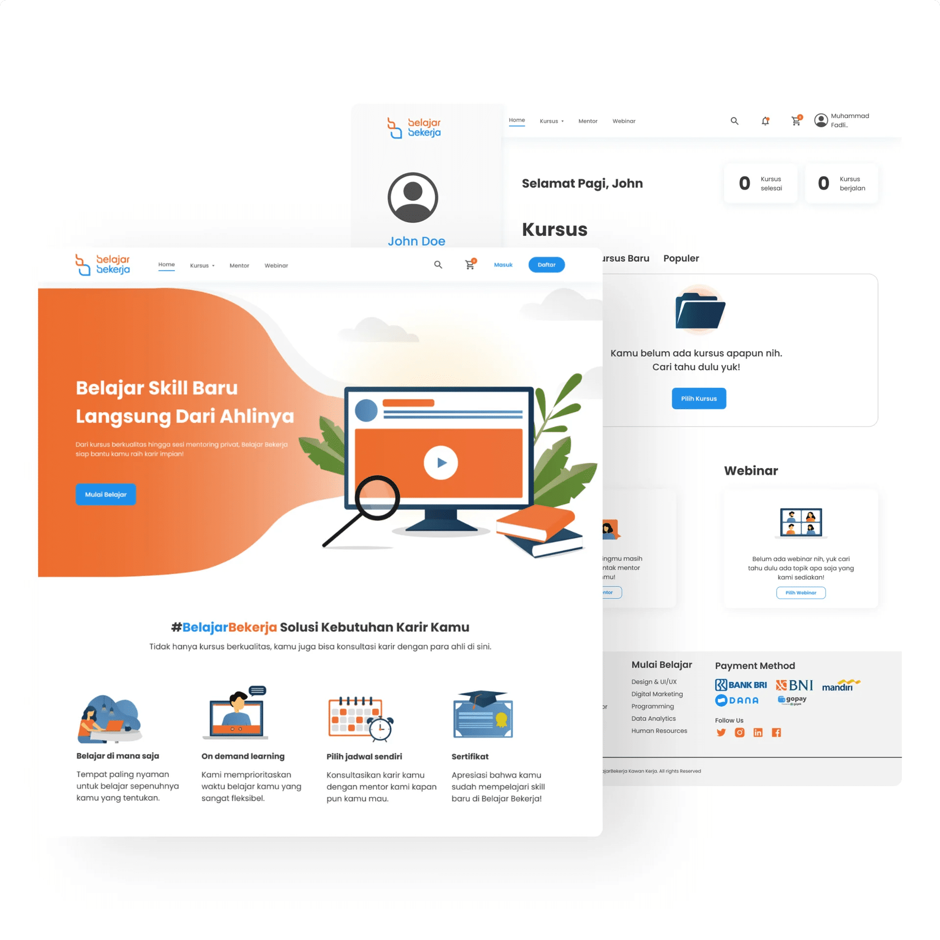
The target audience for Belajar Bekerja is fresh graduates, job seekers, and college students. Belajar Bekerja’s goal is to make the website accessible to all users. With the young audience, Belajar Bekerja aims to exhibit cheerful and fun colors but still remain professional.
Consistency is Key
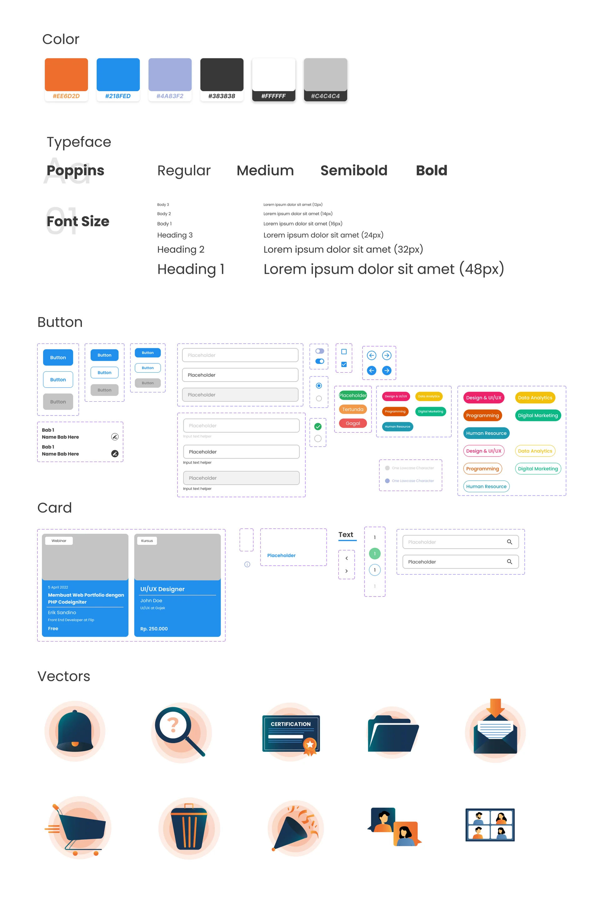
I made 10+ illustrations for Belajar Bekerja and aligned their design system across web and mobile screens. I polished the illustrations which portrayed both a fun and professional atmosphere, with vectors and flat illustrations.
What I learned from Designing for Belajar Bekerja
Collaboration between UI Illustrator, UI/UX Designer, and Product Manager is key to producing a design with a better user experience that aligned with the company’s brand. Within discussion, a UI Illustrator must clearly communicate about which design styles fit for the company. Time management is important to achieve the deadline.
