Convenient to Renting Sports Fields with FITZ
For years, the sports facility rental system has been using a conventional system, namely contacting the owner or manager of sports facilities via telephone, SMS, or WhatsApp. We had an idea to create FITZ — a rental sports field app. Through FITZ, users can rent and see information about sports fields in their closest area or even far away from their reach. We believe that FITZ can bring a much better user experience for users to rent sports fields.
User Flow
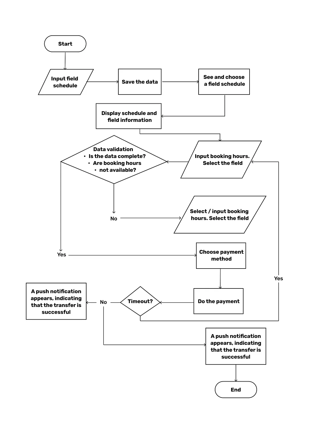
In order to identify the user flows through the app and areas where the navigational flow can be improved, we created a user flow. The flowchart begins with the consumer’s entry point on the product, like an onboarding screen or homepage, and ends with the final action or outcome. In FITZ, the final action consists of a successful transfer, indicating that the user has been successfully transferred through payment for booking the sports field.
Low-Fidelity Wireframe
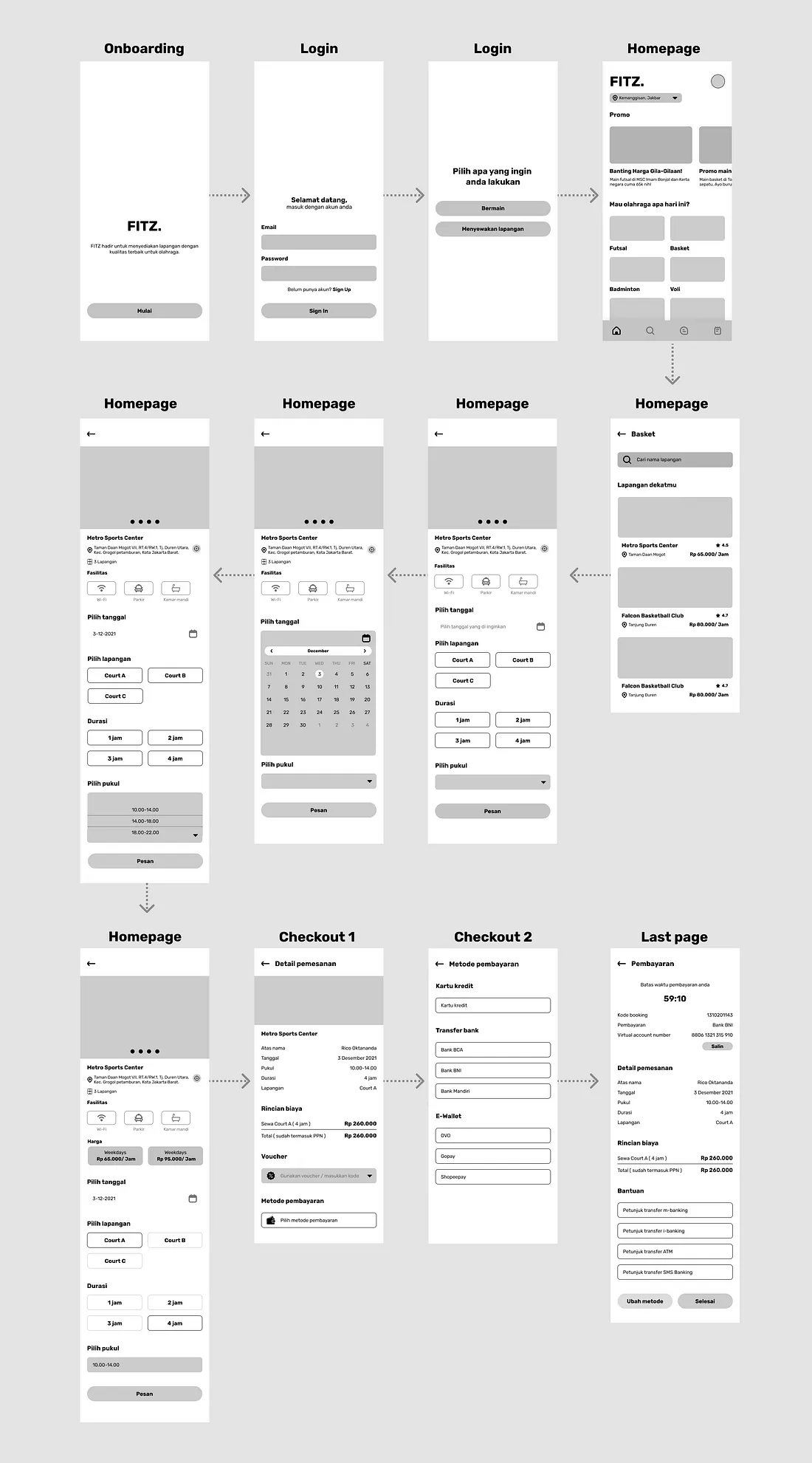
Creating low-fidelity wireframes in UI/UX Design is an essential step involving visualizing digital applications’ skeleton. UX Wireframe provides a blueprint of the page structure, layout, information, and functions. The result of the discussion in Crazy 8s led me to create UX Wireframe to keep the concept user-focused.
Color Palette
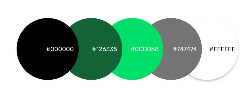
Based on the research by Herman Cerrato entitled “The Meaning of Colors,” green symbolizes growth and harmony. A calming color also that’s very pleasing to the senses. As a sports app, FITZ uses the color green to represent health and healing.
Typography
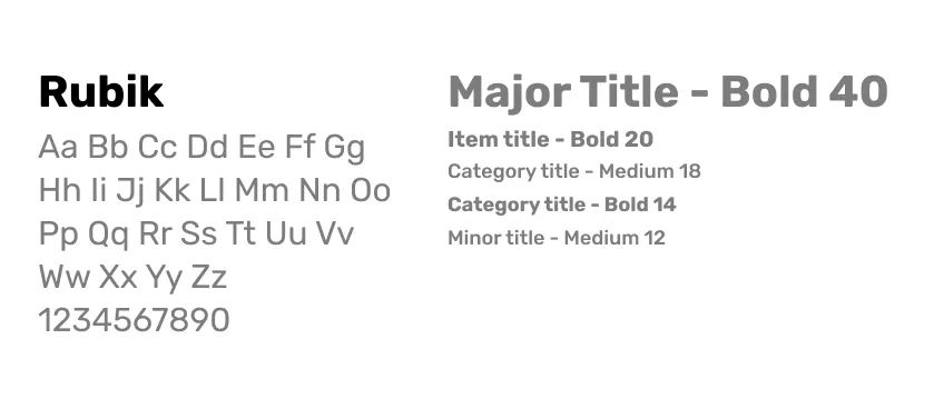
Rubik is a sans serif font family with slightly rounded corners designed by Philipp Hubert and Sebastian Fischer at Hubert & Fischer as part of the Chrome Cube Lab project. Rubik is a 5-weight family with Roman and Italic styles that accompanies Rubik Mono One, a monospaced variation of the Black roman design.
High Fidelity Design
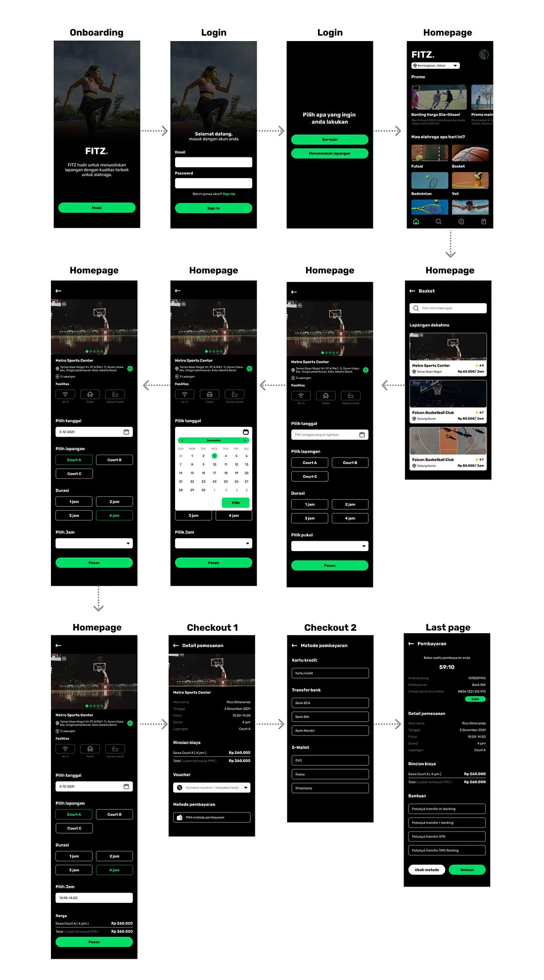
After we decided on the color palette, typography, icons, and name of the application, the high-fidelity design is created. The high-fidelity design includes actual content, typefaces, colors, image dimensions, and branding elements.
What I learned from Designing for Fitz
Research is important to validate our assumptions and how confirm what the users need. Collaborating provides a space to be able to exchange ideas and discuss possibilities that can and cannot be applied. Usability testing is a very crucial step of this project. We can see the pain points felt by the user, then find out which flow is not good and which flow can be maintained.

