

Unveiling The New Interface: Juragan Material’s Homepage Redesign
Juragan Material is an Indonesian B2B e-commerce platform specializing in building materials. We aim to revolutionize the construction industry through digital transformation. This case study details our UI/UX redesign process to enhance user experience and align with the new logo launch on Apr 3, 2023. The goal is to create an engaging, intuitive, and visually captivating homepage that reflects their commitment to excellence.
Background
Juragan Material planned to launch a new logo on Apr 3, 2023. To align with the new branding, adjustments are required for the user interface (UI) on the homepage, header, and footer. The primary goal is to enhance the user experience (UX) by addressing existing issues and making the homepage more engaging and visually appealing.
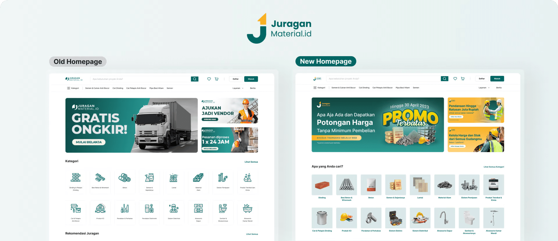
Juragan’s Old Homepage Design
We identified critical issues with Juragan's previous homepage, including low engagement and clickability awareness. To address these challenges, we embarked on a comprehensive redesign, focusing on improving the visual hierarchy and optimizing white space usage. Our user-centric approach aims to create a captivating and seamless user experience, drawing visitors deeper into Juragan's platform
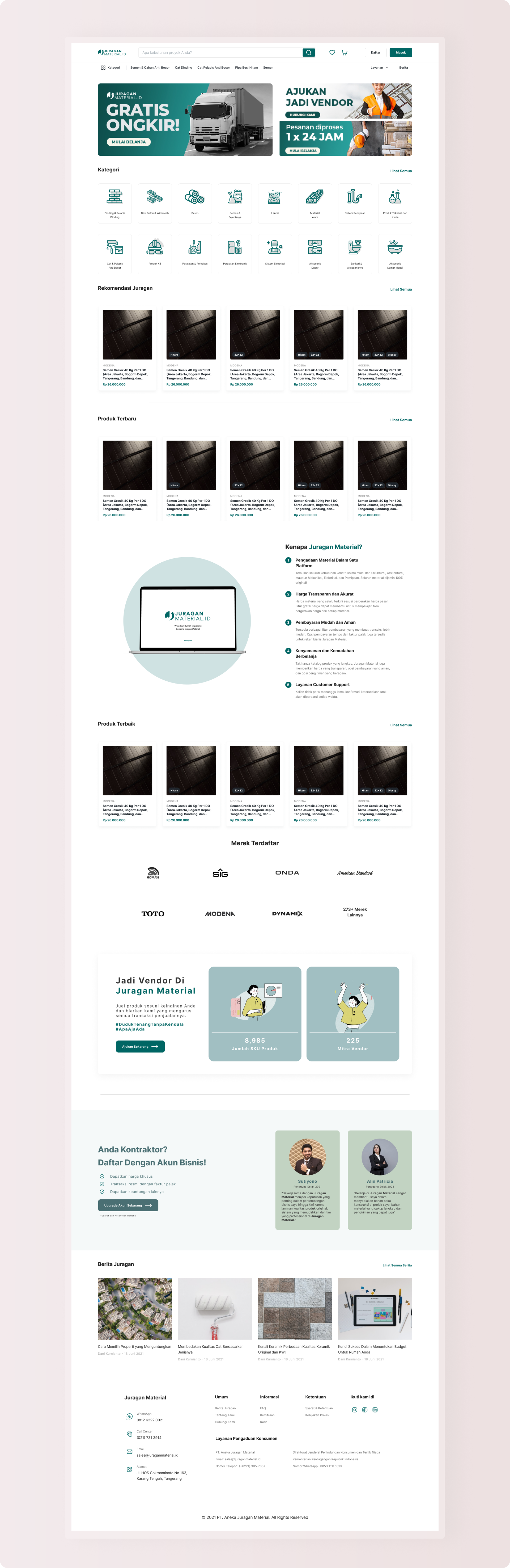
Information Architecture Homepage
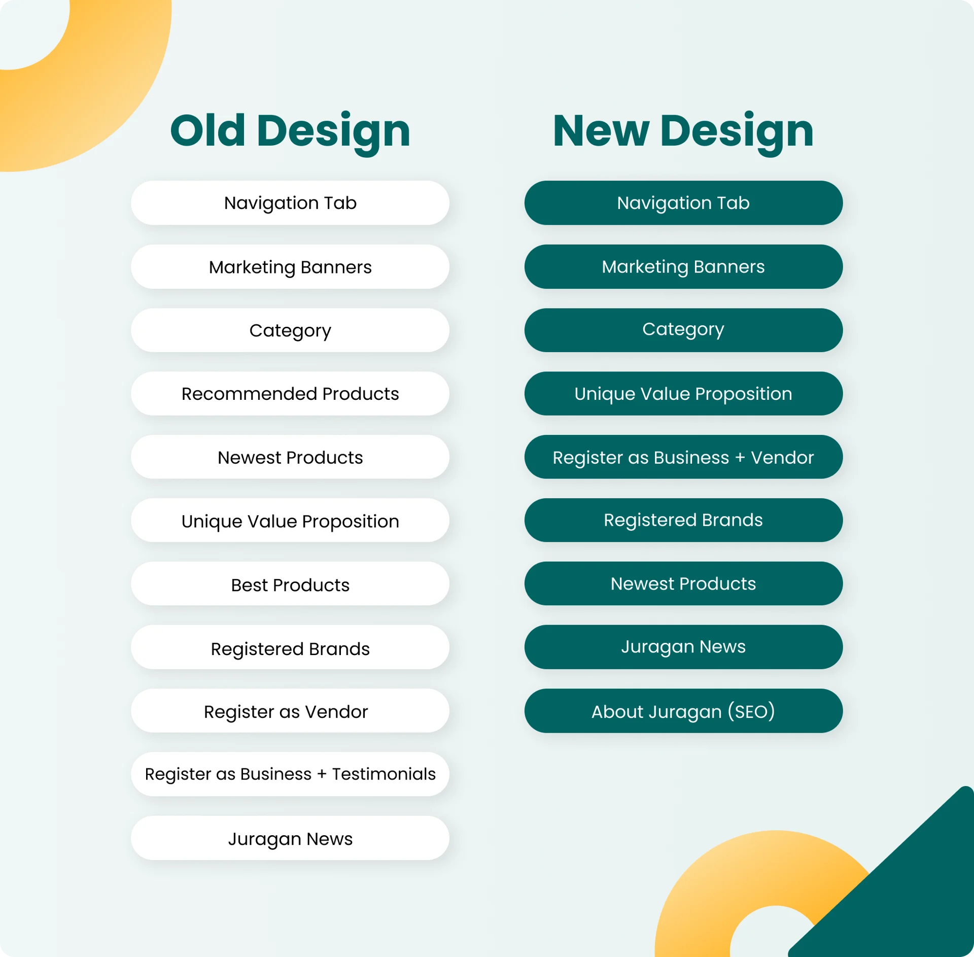
We revamped Juragan Material's homepage by restructuring its information architecture for a more streamlined user experience and optimized white space. The new design combines "Register as Business" and "Register as Vendor" into one section.
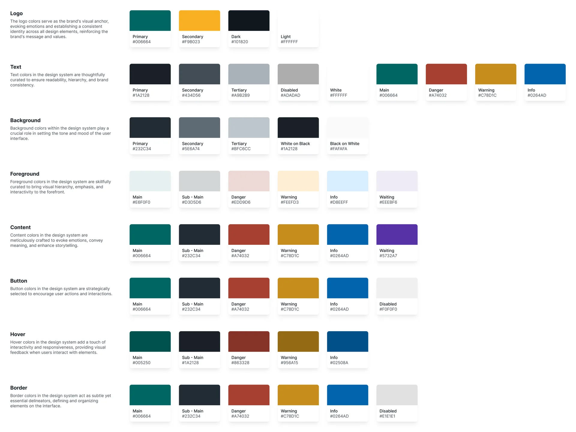
Content Colors of Juragan Material
In the context of Juragan Material's homepage redesign, typography plays a crucial role in conveying a sense of professionalism and clarity to the user experience. While the logo font is Poppins, the decision to use the Inter font for the website's content was deliberate.
Juragan Material’s Typography
.png?updatedAt=1697215667142)
The font's legibility ensures that vital information is easily accessible to users, fostering a seamless browsing experience. By opting for Inter, Juragan Material ensures a consistent and visually appealing presentation that aligns with their industry expertise and trustworthy reputation.
Between old and new banners
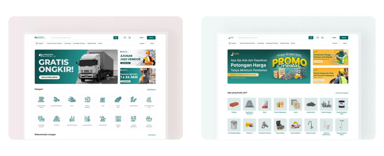
The top banner, being a crucial element of the homepage, required a redesign that captured the attention of users and conveyed Juragan's value proposition effectively. The team collaborated to create a visually compelling banner that featured striking imagery and clear, concise messaging. A balance between aesthetics and information hierarchy was maintained to avoid overwhelming the users.
What I learned from Designing for Juragan Material
This case study's main limitation is the absence of formal research and analysis. Without user research, the design decisions may not fully meet Juragan Material's audience needs. The redesign lacks data-driven insights but serves as an exercise in exploring design improvements. The case study has tight deadlines, limiting in-depth design exploration and iterations. The pressure to deliver quickly may impact thoroughness and testing.